With the change of season, lots of us have redecoration and simple renovations in mind. There’s nothing like a bit of sunshine to encourage you to brighten and make the most of your space, and a simple change of colour or tone can make a huge difference to a room. All you need is a bit of paint!
Little Greene is an independent British paint manufacturer who we are so proud to be able to work with as they are committed to the responsible production of high quality paints (and wallpapers!). We’ve browsed the collection again to find and share some of our favourite Little Greene shades, and hopefully, inspire your next design project!
French Grey
A classic and neutral grey, French Grey is one of the most popular paint colours from Little Greene. It’s a truly timeless and extremely versatile shade, perfect for creating calm living spaces, hallways, bathrooms and bedrooms. Use it alone or as a backdrop to brighter highlight colours such as dusky reds or cool-toned blues. When paired with warm tones, it’s a stunning colour to bring cosiness to a space, perfect for bedrooms and living spaces.
Pair it with: darker greys, terracotta reds, or cool blues
Puck
This is such a bold and confident colour choice that looks stunning when done well. The forest-like shade has plenty of depth and can transform a room. This would look gorgeous in a living room with cool-toned neutrals like greys and whites, or in a bathroom with brass hardware and accessories to compliment the colour.
Pair it with: cool-toned greys, light greens, or a pop of orange

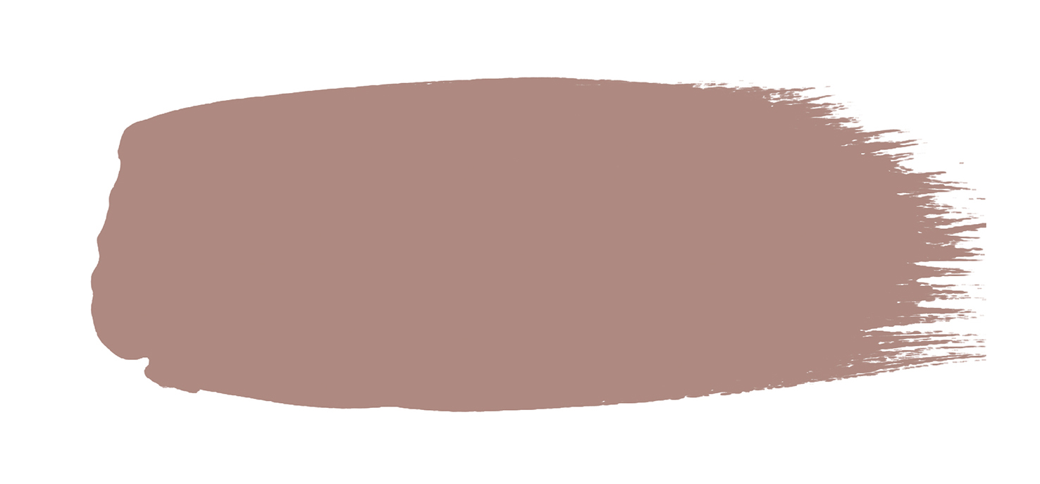
Blush
This is the perfect dusky and muted pink that can be used to create a statement without being too overbearing. Blush is a shade that offers different qualities in different rooms, with an elegant and romantic quality when used in a bedroom, compared to a cosy and warm feeling when used in a living space. This is a colour that you can dress up or down with other shades, like off-whites for a soft contrast, or other bold colours for a pop of colour and fun.
Pair it with: neutral greys and off whites, sage greens, or similar deeper tones.
Confetti
Another pink shade, but slightly truer than Blush, Confetti is a delicate yet usable tone. It’s a classic shade that can be used as an ‘all over’ colour in living spaces, using accessories and soft furnishings to contrast and break up the pink - try using darker shades like Livid (a green-grey). Or, when paired with a white or cream, it’s a really simple way to have a gentle feature wall without being overpowering.
Pair it with: greenish greys, whites, or darker tones.
Marine Blue
Marine Blue is a true statement colour that has plenty of depth to it, and when paired with the right complementary shades it’s not a cold colour, which you often find with blues. It can combine perfectly with nudes and neutrals or other striking colours like oranges and reds for a fantastic contract. It’s a versatile colour that could feature across the home, in living rooms, bedrooms or bathrooms.
Pair it with: pale greys, burnt oranges and coppers, or coral reds
.png)
If you still can’t quite decide on the best shade for your next redecoration project, we stock the full range of Little Greene sample pots and colour cards for you to try out! Our team are also on hand to offer you expert advice on Little Greene products for your painting projects. Come into the shop to browse our samples and order your paint or alternatively, you can buy from our online shop or over the phone.